Number
This item is for capturing a number value, with a standard input field. There is no restriction regarding the number value that can be entered: one should specify some Validation rule in order to ensure the number is in a valid range and/or is an integer vs. float number.
See also the Slider or Rating items to get more control on the data entry.
Preview
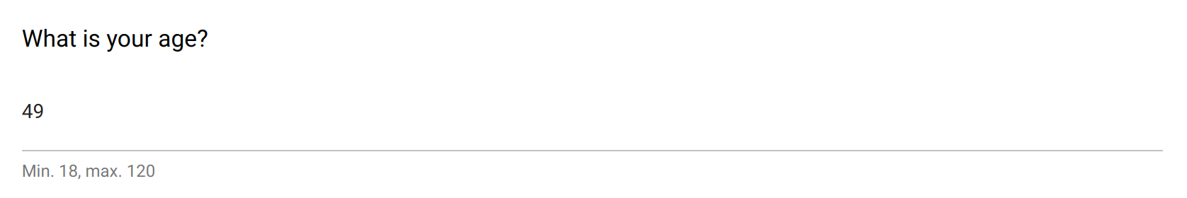
The number field using standard input.
Design
Definition
The standard properties apply:
Property |
Definition |
|---|---|
|
The type of item (see above). |
|
The name of the item is not visible. It is a “variable” name that will be associated to the data collected. You will refer to this variable name when writing condition and/or validation scripts. |
|
The label is usually a question or a title. |
|
The description gives some guidance about how to enter data, what are their meaning etc. |
|
Whether an input is mandatory.
Note that this does not apply when the visibility
Condition is not satisfied. |
The following dynamic properties apply:
Property |
Definition |
|---|---|
|
The condition makes an item visible or not, depending of other data. It is a small script which returns a logical value:
true when item is visible.When no condition is specified (which is the default), the item is visible.
|
|
The validation specifies whether the data entry is correct. It is a small script which returns a logical value:
true when item value is valid.Note that this validation script is not evaluated when the visibility
Condition is not satisfied. |
|
The validation error message to be displayed when validation fails. |
Settings
Property |
Definition |
|---|---|
|
Help text below the input field. |
|
The default value. Make sure it is in the right format. |
Style
Property |
Definition |
|---|---|
|
CSS class to apply to the field label. See How to style a form item? |