Image Select
The dropdown field captures a text or a list of texts. It has some “options”, i.e. possible values that are proposed in a dropdown menu. In addition to these options, an image is to be defined, with some clickable areas. Each image area triggers an option selection. Selecting an option also highlights the corresponding image area.
This field is recommended for having a graphical representation of the options to select. The image can be accessed via an URL or embedded in the form (convenient for offline usage).
Preview
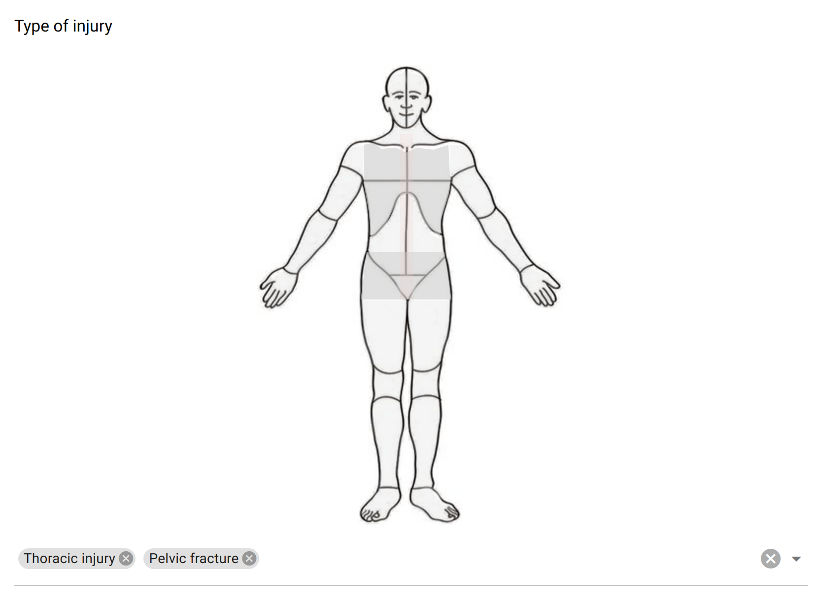
The image select field proposes a clickable image and (optionally) a list of choices to select in a menu.
Design
Definition
The standard properties apply:
Property |
Definition |
|---|---|
|
The type of item (see above). |
|
The name of the item is not visible. It is a “variable” name that will be associated to the data collected. You will refer to this variable name when writing condition and/or validation scripts. |
|
The label is usually a question or a title. |
|
The description gives some guidance about how to enter data, what are their meaning etc. |
|
Whether an input is mandatory.
Note that this does not apply when the visibility
Condition is not satisfied. |
The following dynamic properties apply:
Property |
Definition |
|---|---|
|
The condition makes an item visible or not, depending of other data. It is a small script which returns a logical value:
true when item is visible.When no condition is specified (which is the default), the item is visible.
|
|
The validation specifies whether the data entry is correct. It is a small script which returns a logical value:
true when item value is valid.Note that this validation script is not evaluated when the visibility
Condition is not satisfied. |
|
The validation error message to be displayed when validation fails. |
Settings
Property |
Definition |
|---|---|
|
Help text below the input field. |
|
The default value. Only a single value can be specified, even when |
|
When selected, the captured data is a list of texts. Default is |
|
The list of predefined values, either to be selected or used as suggestions. For provisioning a lot of options, see How to make a select with a lot of options? |
|
The dropdown menu with the options can be hidden. By default it is visible. |
Image
Property |
Definition |
|---|---|
|
The image source can be a link to an image available on the internet (requires network access).
It can also be embedded within the form in base64 format. To help with this operation, the
Upload image field can be used:select a file (
.jpg or .png), and the image source will be automatically filled in. |
|
An image area is composed of: a value (the data collected, which must match an option’s value),
a color (opacity will change when area is selected) and a list of points. Several areas can select the same value.
Points are space-separated x,y coordinates and are describing a polygon shape (rectangle and circle shapes are not supported).
To help with the area coordinates design, some image map tools are avaliable online (for instance Image Map Generator).
These areas can be defined in a CSV (comma separated) or TSV (tab separated) file and uploaded.
See details and examples in How to make an image map?
|
Style
Property |
Definition |
|---|---|
|
CSS class to apply to the field label. See How to style a form item? |
|
CSS class to apply to the image. For instance the image can be centered using |