Auto Complete
The auto complete field captures a text or a list of texts. It has some “options”, i.e. possible values that are proposed for selection after typing a few characters (at least two). It is also possible to use these options as suggestions only and allow entering new values.
This field is appropriate when there is a long list of options (place names for instance) and for reducing text variations with an open field.
Preview
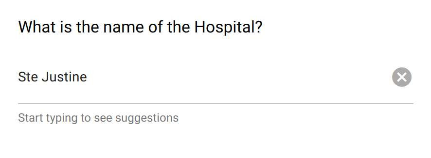
The auto complete field helps with the formatting of open text entries.
Design
Definition
The standard properties apply:
Property |
Definition |
|---|---|
|
The type of item (see above). |
|
The name of the item is not visible. It is a “variable” name that will be associated to the data collected. You will refer to this variable name when writing condition and/or validation scripts. |
|
The label is usually a question or a title. |
|
The description gives some guidance about how to enter data, what are their meaning etc. |
|
Whether an input is mandatory.
Note that this does not apply when the visibility
Condition is not satisfied. |
The following dynamic properties apply:
Property |
Definition |
|---|---|
|
The condition makes an item visible or not, depending of other data. It is a small script which returns a logical value:
true when item is visible.When no condition is specified (which is the default), the item is visible.
|
|
The validation specifies whether the data entry is correct. It is a small script which returns a logical value:
true when item value is valid.Note that this validation script is not evaluated when the visibility
Condition is not satisfied. |
|
The validation error message to be displayed when validation fails. |
Settings
Property |
Definition |
|---|---|
|
Help text below the input field. |
|
The default value. Only a single value can be specified, even when |
|
When selected, the captured data is a list of texts. Default is |
|
The list of predefined values, either to be selected or used as suggestions. For provisioning a lot of options, see How to make a select with a lot of options? |
|
When selected, an entry that is not in the list of options can be added. Default is |
Style
Property |
Definition |
|---|---|
|
CSS class to apply to the field label. See How to style a form item? |